The following article was originally posted on anniehowes' blog on Mar 28th,2008.In this article Annie shares with us how she takes her photos. Also included is a tutorial on how to make an inexpensive light box.A few more similar tutorials can be found on Annie's blog.
You can find lots of supplies for scrabble tile pendants in Annie's Etsy shop.
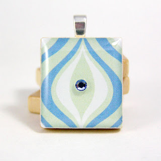
I frequently receive requests on this topic so I thought I’d take the time to blog about it. I’m no photographer by any stretch, however I do strive for good color and sharp images. Not all my photos are great. In fact, each one is probably flawed by some standards, but I do think each product is accurately represented to the best of my ability.
When I first began photographing products I was more consumed with composition than lighting. Good composition doesn’t mean squat if you can’t see the product. As a result, I’ve eliminated most unnecessary clutter from my photographs and focus (no pun intended) on good, or at least decent, lighting. And never, ever, ever use your camera’s flash!
Natural vs Artificial Lighting
There are two schools of thought on this and I subscribe to both. Natural lighting is normally my preference but I rarely have access to good quality natural light. What I mean is if it’s not slightly diffused morning light (ideal), I’m not interested. Direct, midday, and afternoon natural light is totally unacceptable. Products end up with sharp shadows, a dark side, glare, or a cast of unwanted color (afternoon light). Unless you’re one to crop around the entire product, which I am not, I would avoid direct sunlight from any angle.
Natural Light - Before:
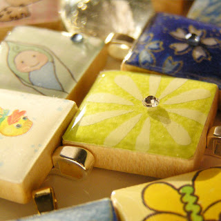
Natural Light - After:
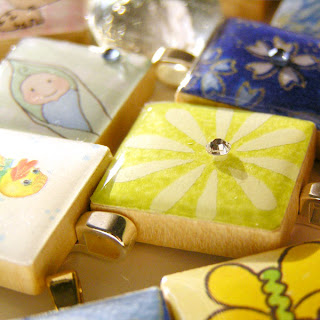
Adjusting to reduce the color shift in afternoon light is far too time consuming since most of my product photos represent the actual item for sale and not a prototype.
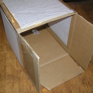
Midday light is great if you have a light studio. A light studio is a cube made from thin white fabric held taught by a wire frame and purchased for $50+ online from many different sellers. Or, it can be easily constructed from a large cardboard box with white tissue papers substituting for the white fabric. The purpose of the photo cube is to diffuse that harsh direct sunlight thereby avoiding those harsh shadows created by direct sunlight.
Because I have limited access to natural light and because I live and work on an extremely windy hill, I have invested in an indoor light studio. It sounds much more grandiose than what it actually is. It all began with a small “hillbilly photo cube” (hey, I live in Kentucky!) that I constructed using a cardboard box and tissue paper and 2 desk lamps with (*gasp*) incandescent bulbs.
Knowing this is an unsatisfactory arrangement (the bulbs were all wrong and the light cube too fragile!), I eventually asked for a photo cube and invested in better bulbs. I still use the 2 desk lamps, but you can see from my photos the end result is not half bad.
Hillbilly Photo Cube:
Than you to Marisa of ElegantSnobbery for allowing me to link to her tutorial on "How to Make A light Cube".
Here’s what I use:
- 2 Desklamps with arms (Walmart)
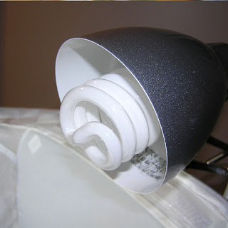
- GE EnergySmart DAYLIGHT bulbs, 100 watt (Walmart or home improvement store)
- Photo Cube
- Props (off-white sketch paper, dictionary, scrabble tiles, etc.)
- Camera
And here's the set-up.
Light bulb:
Click to enlarge this set-up pic:

Here's how I do it:
My digital camera (Olympus Camedia C-765) allows me to use a Macro setting (tulip icon), and I select either ISO 200 or 400. (What is ISO?) The higher the ISO the more light the camera will lens will let in (slower shutter speed). Brighter situations will tolerate a lower ISO setting.
The photo cube allows me to have the front and the top open. I have one desk lamp over the top of the top of the cube shining down over the product (about 10-12 inches above it). The second desk lamp is on the opposite side of the cube and shines through the side of the cube toward the front and side of the product. All other artificial light in the room is normally turned off in order to avoid unwanted glare.
Because I use the macro setting, I can get really close up to the subject. If you don’t have a macro setting, don’t try to get too close and lose focus. I would rather not list an item than list an item with an out of focus photo. The quality of your photos is what helps turn a visitor into a buyer.
Once I have my photos taken (and I normally take about 8 of each item)I pass them through Photoshop for a number of reasons. First, when you’re working with the macro setting every little piece of lint shows up in the photo! So I normally go through the photo and clean up the stray lint specs and smudges on the props being careful to leave the product untouched.
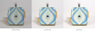
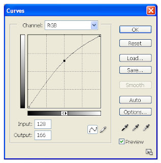
Next, I’ll want to adjust the curves. I do this with just about everything I photograph. What this does is make everything brighter without washing it out. I make a minor adjustment to brighten the image then I adjust the contrast.
Adjusting Curves:
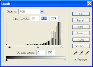
Lastly, I check the levels and make adjustments to the lighter end of things. I want to be sure my whites are white and bright and not grey and dingy looking.
Adjusting Levels - Before:
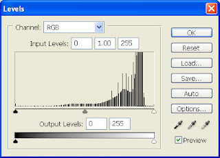
Adjusting Levels - After:
The end result is true to my eye on my monitor in both color and vibrancy just as the original is in the palm of my hand.
If you have any questions, please leave a comment and I will answer as best I can.


this is a great tutorial--thanks for sharing it here!
ReplyDeleteFantastic article. I read the Storque article and learned alot but this was better and easier for me to grasp. Indispensable for a Newbie. Thanks.
ReplyDeleteHi Annie,
ReplyDeleteGreat tutorial. What is the size of the light box?